Good design stands the test of time.
I keep a few examples of vintage design in my office to inspire me to to keep things clean and graphic.
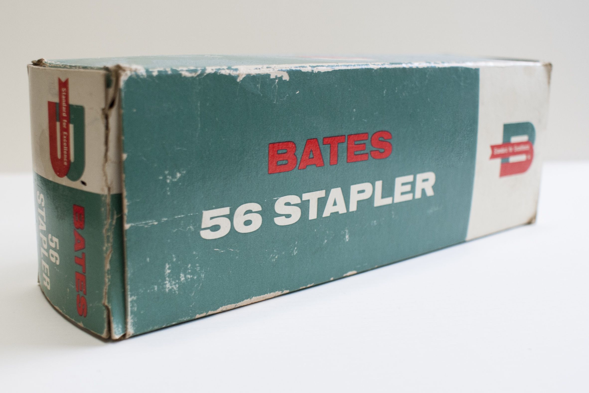
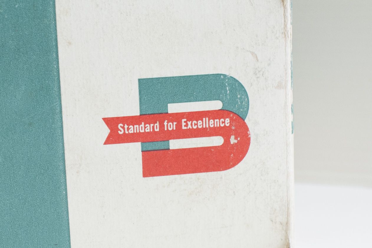
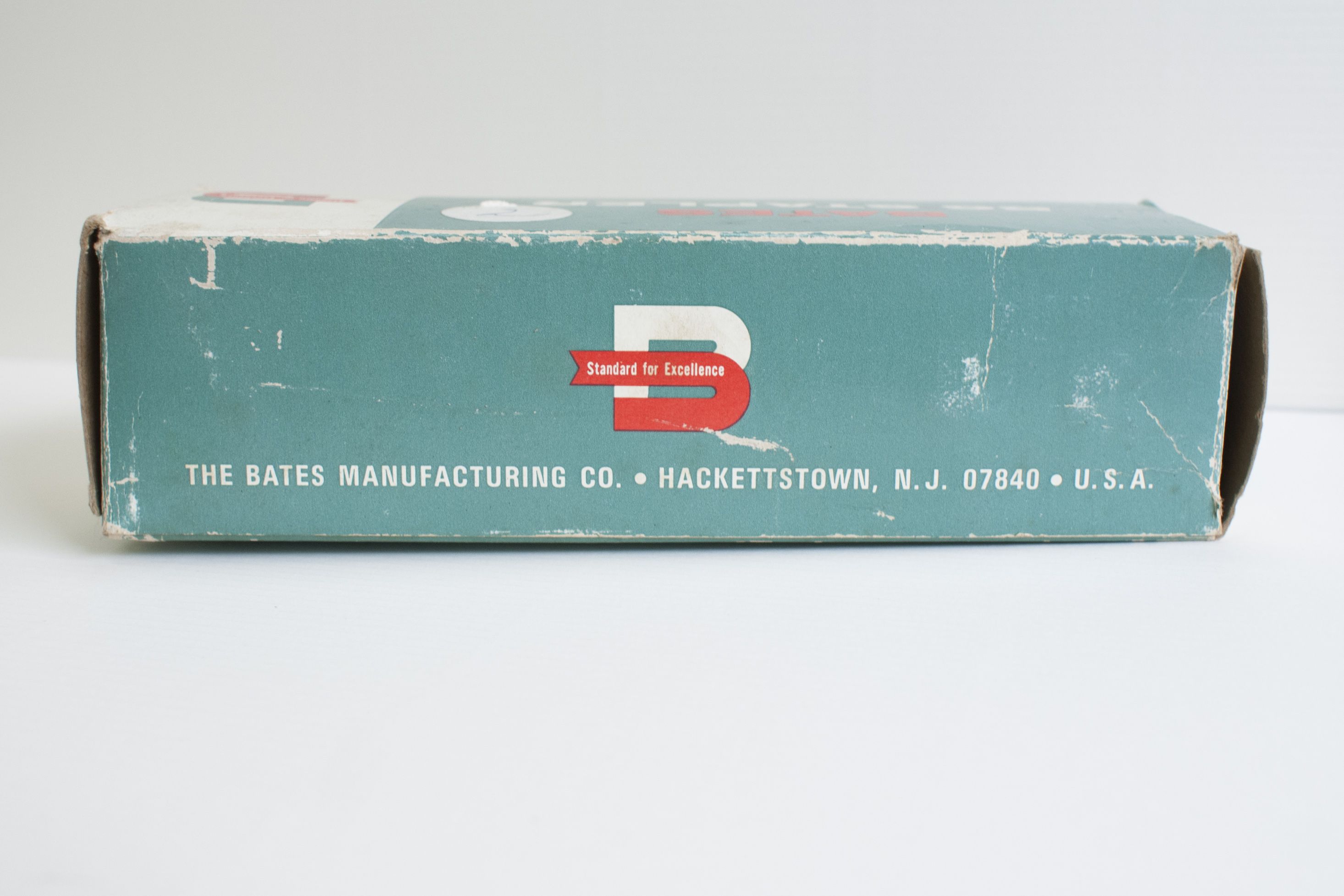
This mid-century stapler package design combines some of my favorite design principles: contrasting colors, practical use of negative space, and bold, simple graphics.
I think this stapler wouldn’t look out of place sitting on a shelf at Target today!
peace and pixels,
amanda