Have you noticed that the color of the document on your screen never matches what comes out of your printer? Or how your neighbor’s screen colors look drastically different from yours?
It’s always bothered me how much care goes into matching colors for print, and how difficult it is to match colors on the web. This has nothing to do with “print designers vs. web designers.” It’s simply a result of our medium: the monitor. No two monitors are calibrated the same way, and, almost inevitably, the colors that I see on my monitor will be different from the colors you see on yours. And it’s almost guaranteed that what prints out of a printer will be different from what can be seen on anyone’s monitor.
I will always remember going on a certain press check and bringing the client along. “Oh, wow!” she exclaimed. “I never knew that text was orange. It always looked brown on my screen.” Fortunately, her exclamation was one of delight — she liked the orange. But it had come as a surprise to her because her monitor wasn’t calibrated, so it displayed distorted, muddied colors.
There are many tools that aid designers when it’s time to go to print, helping to ensure that the colors we get on paper are exactly what we intended. There are Pantone® books, press checks, and even online paper simulators for non-white and off-white papers. All of these are essential to achieving just the right color. After all, if you’re using a corporate color or printing multiple pieces, you want them all to match each other.
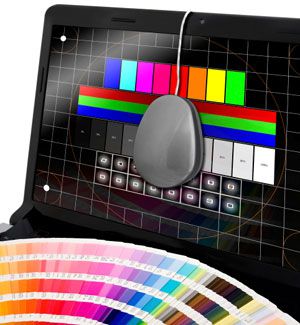
Even though all monitors are calibrated out of the box, they’re all drastically different from one another. How do we know whose is correct? Are there standards for monitor calibration? Fortunately, there are monitor calibrators (they look a bit like mice) that hang over your monitor and detect the colors that it emits. The calibrator can tell you how far off your monitor is and how to adjust it. There are also quizzes and checks online that you can use to guide your calibration. These tools are useful in improving the state of your monitor — but, as anyone with dual monitors knows, you’ll never get two monitors to be exactly the same.
My hope is that both designers and our clients will acknowledge that what we see on a monitor will not be exactly what prints. Also, my hope is that there will be a wider effort by all computer users to calibrate their monitors… even just a little bit. The latter is only wishful thinking; I know that not everyone is aware that they can do that, let alone how to go about it. I can just hope that when I’m on a press check in the future, it’s not with a client who has been working with a severely color-distorted monitor.
